When creating this cover I stuck to red and white colour theme as I felt they were opposites. Red is a bold and violent colour, where white is a pure and calm colour. This gives diversity to the cover as a whole. I got some inspiration from looking at other students covers, I liked how Alex Bond used a diagonal line in the top corner of his Cover I felt that it would be good to include something similar.
Mrs Mann, if you have any problem with viewing the picture let me know and I will try to fix it.
Wednesday, 14 March 2018
Monday, 12 March 2018
Genre Conventions in Soap Operas
Here we are shown the title sequence, this gives a naturalistic feel to the show as the animation is very cluttered and messy. As if it was made by a child creating a scrapbook.
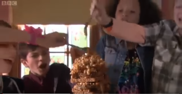
This shows who the target audience is, rebellious teenagers. As you can see that they are messing around with their food, showing that they find entertainment in messing around which most teenagers do.
The show shows that it is meant to be as if it were real as you can see that the table is a mess, and even badly drawn children's drawing on the wall. This tells the audience that there won't be any false aspects of the show.
To stick with soap opera conventions there is always a problem and a resolve, each problem can lead to another problem which is then solved in the next episode, thus keeping consistent viewers.
Subscribe to:
Comments (Atom)
Yr 11 EXAM PRACTICE PAPER: CLASH
PREP Write freely about the house style of Clash music magazine. Your focus is on 'media language', that is, how the musicians are r...
-
In the beginning of the show, we get a view of Brighton. Here the director uses the location mise-en-scene technic. This makes the audie...
-
FRIDAY 25 JANUARY PREP YEAR 11C Refer to Extract 1 in the insert. Analyse the representation of Jamaican Reggae music and musicians such...
-
later on, in the first episode of cuffs, Ryan and Jake are taking a woman into custody, the woman explains that her mother is a lawyer. Ry...


