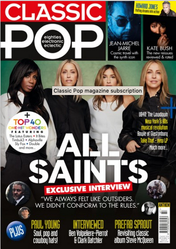
- the stars take up a majority of the cover
- modernity in the sans-serif
- pug in the top right
- glorifying the stars "ALL SAINTS"
PREP Write freely about the house style of Clash music magazine. Your focus is on 'media language', that is, how the musicians are r...
Mark 1 out of 5 on Media Language
ReplyDelete1. This is altogether on the short side - bullet points can still be tightly packed and detailed!
2. way in which the main splash is depicted: very strong, bold, alternate white and black
3. colour palette: effect of monochrome? masculine, formal, bold? Restricted colour palette of black and white for text with yellow accent colour
4. grid layout that is linear, with orderly box-like layout; this connotes seriousness. The 3 three-deck cover lines are grouped and stacked in symmetrical way with yellow accent colour and white font. Linear layout includes emphasis on regularity, which is relatively unusual in a music magazine, normally more creative and free-spirited, even rebellious
5. skip the pug comment;
6. why is it glorifying? I don't see this
7. font choices?